Streamlining scATAC-seq Visualization and Analysis
In contrast to most single-cell RNA-seq analyses, there are many regular tasks when working with single-cell ATAC-seq (scATAC-seq) data, such as peak calling and plotting pileups, that require the BAM file (or something similar) containing some representation of the actual reads. Unlike bulk ATAC-seq data, in which your samples are static and will not change, “samples” in single-cell datasets will consist of groups of similar cells, typically arrived at via clustering. This is often an exploratory and iterative process, so your “samples” can be subject to frequent changes. You might even want to group your cells by other metadata fields entirely.
Since most tools for doing things like peak calling and plotting pileups are designed for bulk samples, they typically require either 1) separate files for each sample or 2) modification of the BAM file to include modified tags/read groups so that the tool knows how to group reads. This means you end up having to duplicate or rewrite BAM files frequently.
While this is doable, it results in two main challenges:
- For large projects with lots of sequencing data, this can become time/space consuming. For example, re-reading and writing a new BAM file with hundreds of milllions to billions of reads takes a good bit of time.
- This breaks up what should be an interactive process. For clustering in particular, where you might like to use qualitative observations from examining pileups for different groupings, this constant splitting of BAM files quickly becomes quite cumbersome in our experience.
Given 10X has recently released their scATAC-seq product and more people generally seem to be working with scATAC-seq data (or soon will be), I thought it could be interesting to share some thoughts on ways we could maybe help address some of these problems. As I note at the end of this post, I may have missed an existing solution, and if so would love to hear about it (or better ideas).
One potential source of inspiration
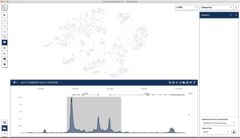
When 10X Genomics released a new version of the loupe browser with support for scATAC-seq data, I noticed one particularly cool feature that tackles this problem. Loupe Cell Browser allows you to load a *fragments.tsv.gz file (described here) that will allow the display of smoothed pileup plots at a given location in the genome.
At first, I thought that these tracks were precomputed, but I noticed that if you manually select groups of cells within the datasets, the tracks update on the fly.
Here is an example where I start with their sample PBMC dataset and the track along the bottom is the bulk track. I then select one set of cells with the lasso tool and then a second, each with very different accessibility profiles at the CD3 locus. After each selection the tracks below update to match. Note that the second one is harder to see because there is very little accessibility at this locus for the second group of cells:
I thought this was a really neat feature and set out to try and make a poor-man’s version of something like it for use with of our own data (collected with our sci-ATAC-seq protocol).
How could we replicate some of this functionality?
My initial thought was that most tools for single-cell analysis store a table with metadata about the cells, such as QC measures, metadata, and cluster assignments. Many of these tools already have native plotting functions that allow coloring by categorical variables within this metadata table, so could you do something similar for pileups?
For example, given an indexed BAM file (or any other file that supports random, indexed access), you should be able to:
- Extract reads from a given locus (fast for indexed files)
- Group reads using the cell IDs encoded in the file and the metadata provided by the user
- Output normalized pileups that follow this grouping
For example, you could tell the plotting function to group by the cluster column in your metadata. If you recluster the cells into a new set of groups or want to make pileups according to a completely different grouping variable, you would no longer have to re-write the entire BAM file just to do that, you could instead simply rerun the plotting call with a different set of arguments.
Since we already convert reads to BED format prior to peak calling, I just added an additional column to that file encoding the cell ID and used this for the purposes of this exercise rather than the BAM file:
chr1           10003          10053          CTTGATTCAACGCCGATATCGAACGTCAGG
chr1           10045          10095          CGAGGCTACCGCCTCGGTAAATGAAGCTTG
chr1           10061          10111          AGAGTCCGAGACGGACCTGCATCCTTGGAG
This file can then easily be block gzipped and indexed with tabix. You could also achieve something very similar using the BAM file directly, this was just easier for me given what we had immediately available.
We could then provide a table with cluster assignments (note this would already exist if you were using within an existing single-cell tool). I also provide a total reads column here for the purposes of some very basic normalization:
cell                              group       total_reads
CTTGATTCAACGCCGATATCGAACGTCAGG    cluster_1   10837
CGAGGCTACCGCCTCGGTAAATGAAGCTTG    cluster_2   12012
AGAGTCCGAGACGGACCTGCATCCTTGGAG    cluster_3   9002
Now all that is left to do is implement some basic code to take these pieces and produce grouped pileups.
A very rough R function for generating grouped pileups
As an example of the above, I made a quick function that would take a chromosome, start coordinate, and end coordinate of the region to be plotted, the tabix indexed BED file, the grouping table with total read counts. It also takes an EnsDB object to allow genes in the region to be plotted and takes a window (in base pairs) to use when smoothing the resulting tracks. Note that it would be pretty trivial to have a function that allows gene names to be passed instead for convenience.
In this case I made a few very basic attempts at normalization that may not ultimately be ideal. Each read contributes 1/total_counts for its respective cell. I then divide the track for each group by the total number of cells in that group to normalize for size differences between clusters. I then perform some windowed smoothing to the track within each group and downsample the number of bases to display just to speed things up a bit.
Note that the code below is just meant to put something slightly more specific behind the idea above. There are certainly better ways to do each step of this and there may be errors. My hope is just to be a bit more specific and provide a starting point:
library(dplyr)
library(zoo)
library(ggplot2)
library(seqminer)
library(EnsDb.Hsapiens.v75)
library(ggbio)
library(patchwork)
library(stringr)

plot_region_pileups = function(chrom, # chromosome
                                start, # start coordinate
                                end, # end coordinate
                                bam_bed_file, # tabix indexed BED file with chrom,start,end,cell
                                grouping, # dataframe with cell,group,total_reads
                                ensdb=EnsDb.Hsapiens.v75, # EnsDb to allow display of genes
                                smoothing_window=100, # window to use for averaging
                                x_steps=3000) { # limits number of actual to plot data for

  # Validate the grouping dataframe
  if (! all(c('cell', 'group', 'total_reads') %in% colnames(grouping))) {
    stop('Grouping DF must have cell, grouping, and total_reads columns.')
  }

  # Get reads for the requested region of BED file (using tabix)
  range_string = paste0(chrom, ':', start, '-', end)
  reads = seqminer::tabix.read.table(tabixRange=range_string, tabixFile=bam_bed_file)
  colnames(reads) = c('chrom', 'start', 'stop', 'cell')

  # Get count of cells per group for normalization
  grouping = grouping %>%
    group_by(group) %>%
    mutate(cells_in_group = n()) %>%
    ungroup()

  # Restrict to cell barcodes specified by user
  reads = dplyr::filter(reads, cell %in% grouping$cell)
  reads = dplyr::inner_join(reads, grouping, by='cell')

  # Expand reads so have one line per base
  expanded_ranges = dplyr::bind_rows(lapply(1:nrow(reads), function(i) {
    interval = reads[i, 'start']:reads[i, 'stop']
    return(data.frame(position=interval,
                      value=1,
                      cell=reads[i, 'cell'],
                      group=reads[i, 'group'],
                      scaling_factor=reads[i, 'total_reads'] ,
                      cells_in_group=reads[i, 'cells_in_group']))
  }))

  # Apply scaling factor and account for different cell counts
  # Also apply windowed smoothing
  expanded_ranges = expanded_ranges %>%
    group_by(position, group) %>%
    summarize(total=sum(value / scaling_factor) / mean(cells_in_group)) %>%
    group_by(group) %>%
    arrange(position) %>%
    mutate(total_smoothed=zoo::rollapply(total, smoothing_window, mean, align='center',fill=NA)) %>%
    ungroup()

  # Finally, restrict to x_steps points for plotting to speed things up
  total_range = end - start
  stepsize = ceiling(total_range / x_steps)
  positions_to_show = seq(start, end, by=stepsize)
  expanded_ranges = subset(expanded_ranges, position %in% positions_to_show)

  # Make plots faceted by group
  max_value = max(expanded_ranges$total_smoothed, na.rm = TRUE)

  plot_object = ggplot() +
    geom_bar(data=expanded_ranges, aes(position, total_smoothed), stat='identity', color='black', fill='#d3d3d3', alpha=0.3) +
    facet_wrap(~group, ncol=1, strip.position="right") +
    ylim(0, max_value * 1.4) +
    xlab('Position (bp)') +
    ylab(paste0('Normalized Signal (', smoothing_window, ' bp window)')) +
    theme_classic()

  # Add gene track using ensembl ID
  gr <- GRanges(seqnames = str_replace(chrom, 'chr', ''), IRanges(start, end), strand = "*")
  filters = AnnotationFilterList(GRangesFilter(gr), GenebiotypeFilter('protein_coding'))

  genes = autoplot(ensdb, filters, names.expr = "gene_name")

  genes_plot = genes@ggplot +
    xlim(start, end) +
    theme_classic()

  # Now combine the two plots into one (using patchwork)
  return(plot_object / (genes_plot + xlim(start, end)))
}
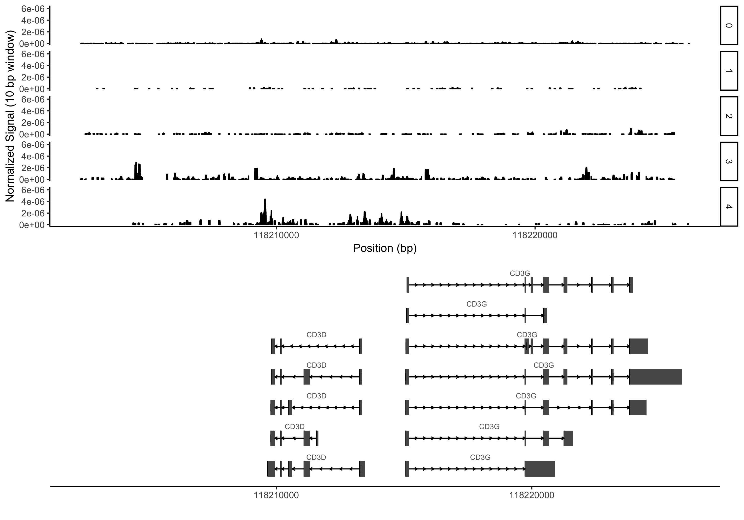
Trying out an example
I’ve made up a couple very small test files that only contain reads from the same CD3 locus I used as an example above (this time on a different dataset from our lab):
You would also need to have tabix installed (now part of htslib) in addition to R and the R libraries loaded in the code above. Here is an example command using the test files:
grouping_table = read.delim('grouping_table.txt', sep='\t')
plot_region_pileups('chr11', 118202327, 118226182, 'example.bed.gz', grouping=grouping_table, smoothing_window=10, x_steps = 10000)
Hopefully having done all that you would see something like the plot below (again, this is an entirely different dataset than above with fairly arbitrary cluster assignments):
Wrapping up
It seems like at least for visualizing pileups, there should definitely be a route to a workflow that doesn’t involve having to duplicate or modify BAM files. Ultimately, this sort of thing would require some agreement on the input format for reads (indexed BED, indexed BAM, some other file format like the one provided by 10X) and potentially support for common conventions for annotating each read’s associated cell ID. This general idea should apply to any other datatype where pileups are commonly used for visualization, not just scATAC-seq data.
It is entirely possible that someone else (other than 10X) has already done something like this and that I have missed it. If there is something out there, I would love to hear about it. I don’t currently have time to turn the above into something more fully functional. My hope is that maybe developers of existing tools like this basic idea enough to incorporate something like it (or come up with something better :) as they start to think about supporting scATAC-seq data.
There are also other tasks like motif enrichment, where there are already good ways to avoid stepping out of an interactive environment. For example, we and others have generated matrices of motifs by peaks ahead of time, recording which peaks have a match for a given motif. The resulting matrix can then be multiplied by the corresponding peak by cell matrix to get motif count by cell matrices. This can be performed using any subset of sites (say differentially accessible peaks within a given group) and used to test for motif enrichment within specific peak sets all within R and without having to redo motif calling.
Ideally, it would be awesome if other types of tools like peak callers would support grouping of reads using secondary metadata to support single-cell datasets more effectively, although this would likely not be nearly as trivial as the above.
comments powered by Disqus